Can a dumb phone launcher replace a dumb phone?
ou pull your phone out and your thumb is already on the screen before the thought catches up. Here's how to dumb down your Android in ten minutes — no new phone, no uninstalls.
Most of the time, yes. The home screen is the lever — not the apps.
You pull your phone out of your pocket. You don’t remember why. Your thumb is already on the screen before the thought catches up, and thirty seconds later you’re on a feed you didn’t open on purpose. Nothing has happened — no notification, no plan — but you’re there.
Americans now pick up their phones 186 times a day, according to Reviews.org’s 2026 cell phone usage report. Millennials lead at 324. Gen Z averages 185. That’s once every five or six waking minutes, every day, for years. Not because people love their apps. Because the home screen rewards the reach. That’s why a dumb phone launcher gets considered in the first place — and why it often works as well as buying a new device.
This post is about the second path. You’ve probably seen the Light Phone, the Boox Palma, the Punkt — small, handsome, $250 to $400, and designed to do almost nothing. They work. But you don’t actually need a new phone to get most of the effect. You need to change what your existing phone looks like when you wake it up. Below, how to do that in about ten minutes.
Why do you pick up your phone 186 times a day?
Not because the apps are particularly interesting on any given pickup. Most of the 186 are empty checks — a glance, a swipe, a return to pocket. The Washington Post reported in 2025 that this pattern of constant checking measurably drains focus and working memory, even when the phone never produces a notification worth reading. The cost isn’t the time on the apps. It’s the attentional residue each reach leaves behind.
The mechanism is a plain habit loop: a cue (boredom, transition moment, small discomfort), a routine (reach and unlock), a reward (a tiny hit of novelty, usually colour, movement, or a notification badge). The loop runs below conscious thought, which is why most people can’t give a reason when asked why they just checked.
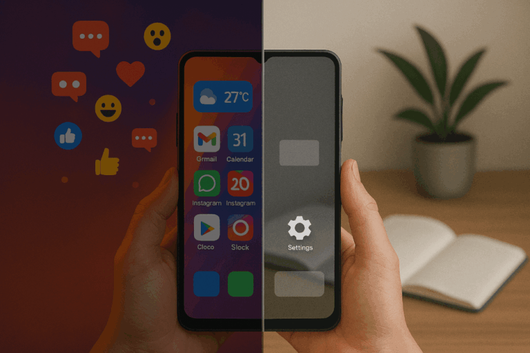
The important thing is that the reward lives on the home screen, not inside the apps. Colour icons arranged in a grid. Red badges. A Google search bar. A widget with a tap-to-open animation. The home screen is designed to give you a small payoff for looking at it — regardless of whether you open anything. The apps are where the harm compounds, but the home screen is where the reach starts.
You’re not picking up your phone because you love your apps. You’re picking it up because the home screen rewards you for it.
What does “dumbing down” a smartphone actually mean?
Walk through the usual advice and you’ll notice it all aims at the same target. Uninstall Instagram and TikTok. Turn on OS-level grayscale. Set up Digital Wellbeing’s Focus Mode. Disable mobile data. Block sites with Family Link. All useful. All aimed at the apps.
None of that touches the home screen. You still unlock to the same grid of colour icons you had yesterday. The reach still pays off the moment you look at the phone, because the surface still rewards looking at it — whether the app behind the icon is installed or not.
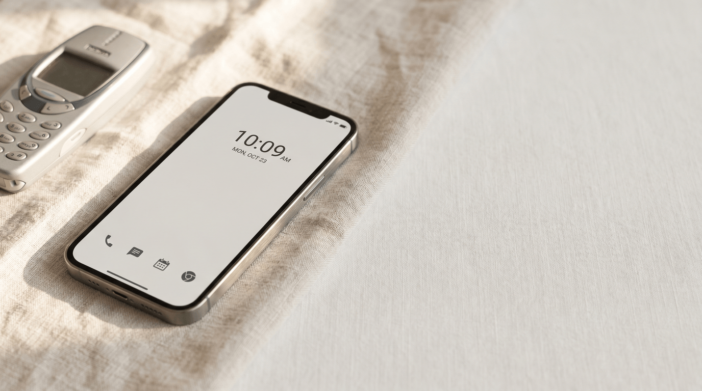
A real dumb phone works differently. It doesn’t remove apps. It removes the surface that makes apps feel available. You wake up a Light Phone and you see time, date, a phone number pad. That’s it. Nothing to explore, nothing to check. The pickup returns no reward, so the pickups drop. That’s the whole trick. A dumb phone isn’t an achievement of restraint; it’s an engineered absence of reward.
A dumb phone works because it changes the surface. The surface is the lever, not the apps.
Can a dumb phone launcher really replace a dumb phone?
For most people, yes. For some, no. The honest answer depends on what caused the reach in the first place.
The yes case is the common one. You want fewer distractions but you still need maps to get home, a calendar that syncs with work, messaging that isn’t a 2006 T9 keypad, and a camera that isn’t embarrassing. You’ve tried Screen Time limits and blown past them. You’ve deleted Instagram three times and reinstalled it each time. For you, the problem isn’t that you don’t have self-control. The problem is that your phone rewards you every time you look at it, so you look at it. Change the surface, and the loop starves.
The no case is smaller but real. You’ve genuinely tried every software intervention — launchers, grayscale, Focus Modes, app timers, cold-turkey deletes — and you drift back inside a week every time. At that point, Psychology Today’s case for dumb phones is the right one: if self-control tools aren’t enough, hardware removal is. Buy the Light Phone. The money is worth it.
The trade-off between the two is worth naming directly:
- Cost. A launcher is free. A dumb phone is $250 to $400 plus a second line or a SIM swap.
- Reversibility. A launcher unset takes two taps. A dumb phone commits you until you sell it.
- Essentials. A launcher keeps maps, calendar, banking, work chat, camera, rideshare — one swipe away, not on the main surface. A dumb phone drops most of those on purpose.
- Commitment signal. A dumb phone is a visible choice. A launcher is private. That matters to some people.
Start with the launcher. If after a month you’re still reaching the same way, the hardware route is still there.
How do you dumb down your Android in 10 minutes?
Six steps. None of them require uninstalling an app. All of them are reversible.
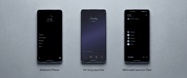
- Install a minimalist launcher. This is the whole move. Yin Yang Launcher is the one used throughout this guide — free, no ads, and the essentials stay reachable. If you want to compare options first, the minimalist Android launchers roundup covers the five best picks and where each one lands on the spectrum.
- Set it as your default home app. Android will ask the first time you press Home. Pick your launcher, tap “Always.” That’s the surface swapped. The old home screen is still there if you reset the default later — nothing is lost.
- Trim the home screen to four or five essentials. Phone, messages, maps, camera, calendar. That’s usually the list. Everything else goes into the app drawer one swipe away. The home screen should look intentionally sparse — not because sparse is aesthetic, but because each extra icon is a tiny reward you’re paying on every unlock.
- Turn on grayscale icons at the launcher level. This is the underrated step. OS-wide grayscale (the Android setting) drains colour from everything — your photos, your navigation, your wifi indicator. Launcher-level grayscale only drains colour from the home screen icons. Maps stays blue. Photos stay saturated. But Instagram’s pink-orange gradient goes grey, and the dopamine draw of the icon drops with it. Both forms work; the launcher form is the one people actually keep on.
- Enable a pause on two or three attention-trap apps. A short, breath-long delay before the app opens. Not a block — you still get through if you want to. But the delay catches the reflex before the scroll starts. How Mindful Pause works, why one second is often enough, and what research says about the mechanic are covered in the Mindful Pause deep-dive.
- Leave notifications alone for now. Most dumb-down guides open with a notification purge, but that’s a second-week task. The surface swap above will drop your pickups by a meaningful amount on day one. Come back to notifications once you’ve seen what’s actually still reaching you after the home screen stops rewarding the reach.
Total: about ten minutes, one cup of coffee. No app uninstalled, no subscription, no commitment beyond the two taps it takes to revert.
Do you still need grayscale, app deletion, or Focus Mode?
Grayscale: yes, still useful. The 2024 Sage Journals study by Dekker and Baumgartner on grayscale interventions found roughly 20 minutes a day of screen-time reduction even when stacked on top of other changes. The effect is additive, not redundant. If you’ve done launcher-level grayscale on icons, OS-wide grayscale inside apps (Instagram itself, TikTok itself) stacks on top.
App deletion: optional, and usually unnecessary after the launcher swap. Hiding an app behind the drawer removes it from the reward surface without removing it from the phone. Most of the benefit of deleting Instagram comes from not seeing Instagram when you unlock — which the launcher already accomplishes. Keep deletion as a fallback, not a starting point.
Focus Mode: depends which one. Android’s built-in Digital Wellbeing Focus Mode is a time-boxed on/off — useful for a two-hour study block, less useful as a default posture. A launcher’s always-on minimal surface doesn’t need to be enabled and disabled; it’s just how your phone looks now. Use OS Focus Mode for the study block. Let the launcher handle the rest of the day.
What will you miss in the first week?
A few things. The visual density of the old home screen, for one — it takes a few days for the grey, sparse surface to feel normal rather than broken. Muscle memory for the apps that used to live in the corners — your thumb will reach for where TikTok used to be and find nothing there. That part usually sorts itself out by day four or five.
What you’ll notice instead: you’re bored more often. Small gaps in the day — the elevator, the queue, the two minutes before a meeting — stop getting filled automatically. This is the point. Boredom is a signal the loop has stopped running, and it’s also the state most people are actually trying to recover when they reach for the phone in the first place.
People who switch to minimalist launchers commonly report pickups dropping by half or more within two weeks, and a small battery gain (10–15%) because the launcher itself renders less. The pickup drop matters more than the battery. Look at your phone’s Digital Wellbeing dashboard on day seven. That’s the number worth reading.
In week one you’ll notice you’re bored more often. That’s the point.
Start with one swap
If you’ve read this far you’re probably not debating whether your phone use is a problem. You’re debating whether a launcher is serious enough to solve it, or whether you need to spend $300 on a new device. Try the free option first. Install a minimalist launcher, set it as default, leave it for 48 hours. If it doesn’t stick, revert in two taps and buy the Light Phone with a clearer conscience about what you actually need.
If you want a launcher that keeps the essentials one swipe away, Yin Yang Launcher is free on the Play Store. No ads, no tracking, and the pause-before-opening mechanic is built in from the first open.
Further reading
- Best minimalist Android launchers in 2025 — the full roundup of five picks, where each one lands on the spectrum from sparse to balanced.
- How a mindful pause reduces screen time — the research behind the one-second delay and why it interrupts the reach reflex.
- How to stop doom scrolling on Android (without blocking apps) — the same soft-friction thesis applied to the scroll itself, not the reach.
Sources
- Reviews.org (2026) — Cell Phone Usage Stats 2026: Americans Check Their Phones 186 Times a Day — reviews.org
- Washington Post (2025) — Why constantly checking your phone can drain your focus and memory — washingtonpost.com
- Psychology Today — Dumb Phones Are Smarter Than You Think — psychologytoday.com
- Dekker & Baumgartner (2024), Sage Journals — Is life brighter when your phone is not? The efficacy of a grayscale smartphone intervention addressing digital well-being — journals.sagepub.com